
“How is our brand showing up on AI platforms?”
☝️That’s a question board members and CEOs are asking their marketing teams.
And while we’ve always been able to answer that in Scrunch, the way data was visualized left room for improvement.
Today, that changes. We’ve made data visualization in Scrunch far more intuitive, customizable, and shareable.
Here’s a quick rundown of the quality-of-life improvements we’ve made:
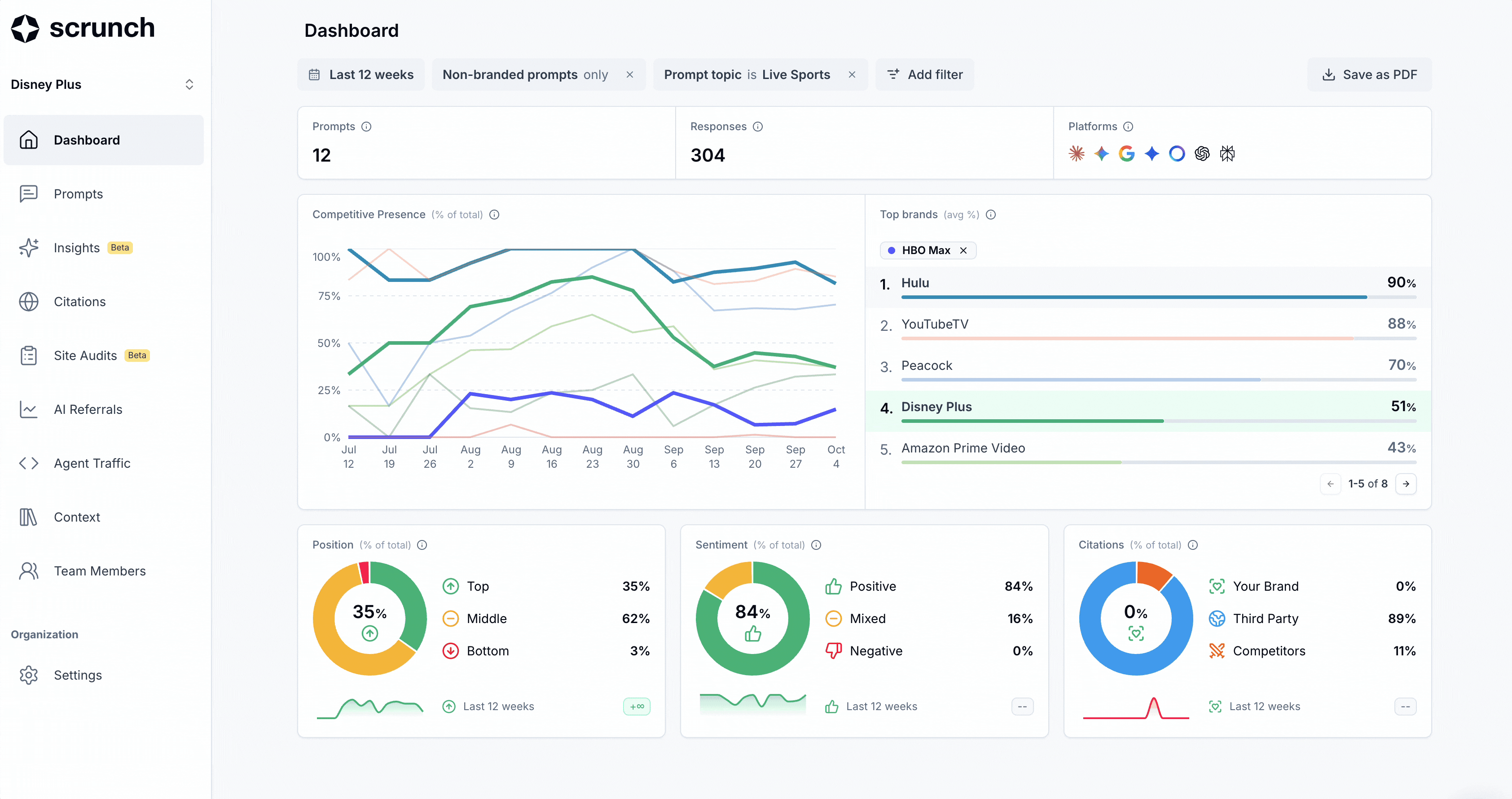
📈 Line charts > 📊 Charts
When tracking performance over time, line charts are almost always the better choice. They make it easier to spot trends and anomalies. And that’s just the type insight that’s a time saver when diagnosing causation behind performance.
Line charts are now the default view for the Competitive Presence chart in your Scrunch dashboard.
Not only that, you can also now select to highlight any competitors you’re tracking for clearer, head-to-head comparisons.
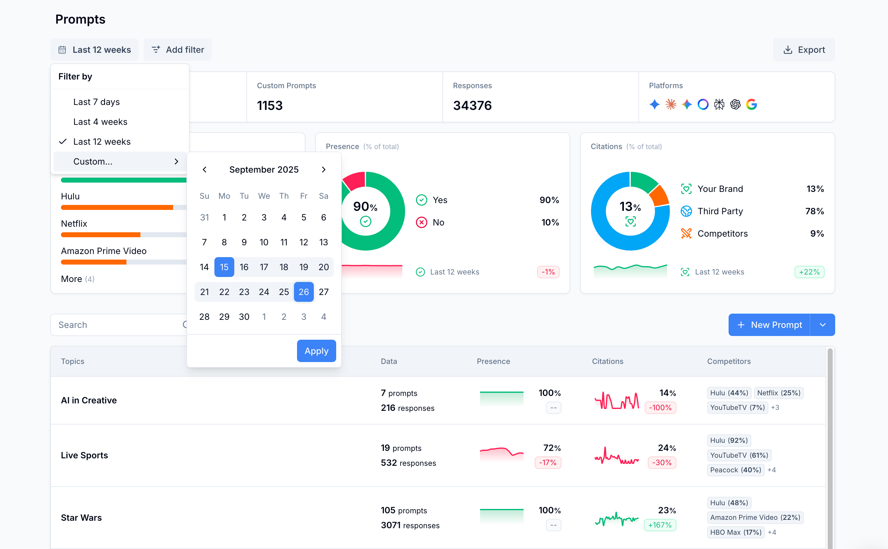
📅 Custom date ranges
You can now select and apply custom date ranges across all of Scrunch. Yes, it’s a table-stakes feature, but one that’s recently available in the last couple weeks. In addition to the Competitive Presence dashboard, custom data ranges can also be applied views for Prompts and Citations.
📄 Save reports as a PDF
We’ve added a simple but powerful feature: Save any visualization as a PDF. Just click “Save as PDF” and a shareable report will be generated instantly.
Now, when your CEO or board asks about AI search performance, you can quickly share a clear, visual report--no extra explanation required.