


TLDR:
- Signals automatically surfaces meaningful changes in your AI search data, why they matter, and what to do about them.
- Explorer gives you self-serve analytics built on top of your live AI search data—fully customizable, instantly shareable, and queryable by click or natural language.
- Scrunch's in-app AI assistant, Scrunchie, works across both. Diagnose data shifts with a button press and build bespoke data visualizations with a command.
- Signals and Explorer are now generally available for all Scrunch customers on all plan levels.
There are 50-plus tools that can tell you if ChatGPT mentioned your brand. Almost none can tell you why it matters or what to do next.
Our latest launches—Signals and Explorer—are our answer.
Signals is designed to do the detective work for you. It automatically flags meaningful changes in your AI search data and pushes actionable insights straight to you.
Think of it like an autonomous assistant whose job it is to find out what's changed, explain why it matters, and tell you what to do about it—in Scrunch or your email inbox.
You can instantly investigate any signal, find out what’s driving the shift, and uncover opportunities with the help of our in-app AI assistant, Scrunchie.
Explorer picks up where Signals leaves off. It provides a self-serve analytics surface built on top of your live AI search data—completely customizable, easily shareable, and featuring a level of granularity unmatched on the market.
You can use it to ask and answer any question you have about your AI search performance, either with a few clicks inside of Scrunch or with natural language via Scrunchie.
Together, they cover the full observability loop: Signals automatically alerts you to significant movement, Scrunchie helps you diagnose what's behind it, and Explorer lets you drill down deeper—whenever and however you want.
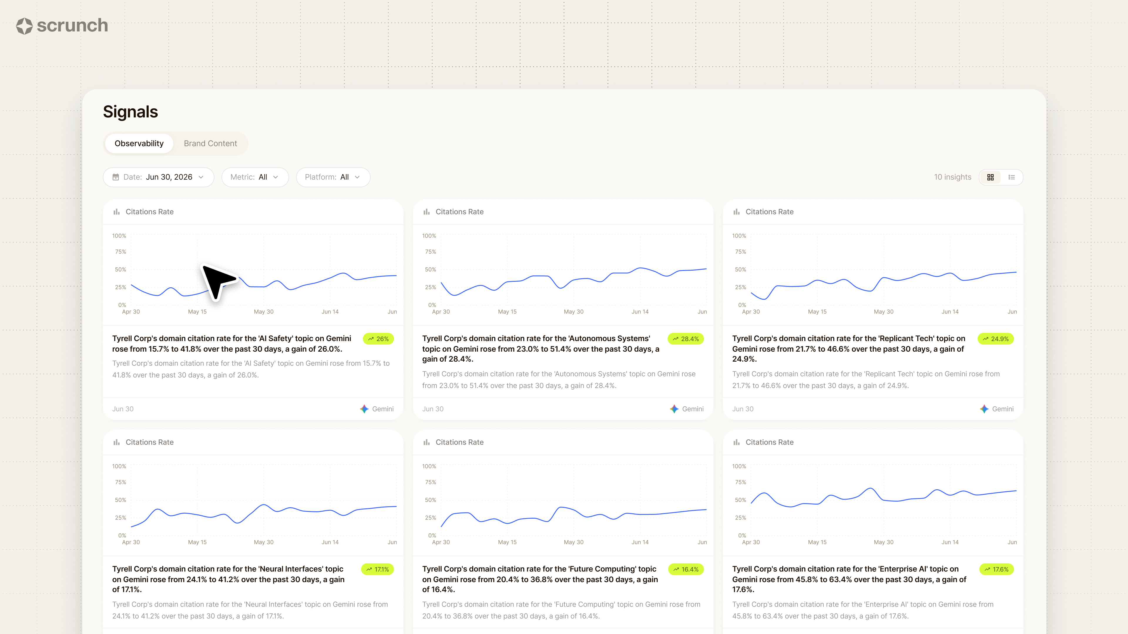
Signals: Data discoveries, delivered to your door
No matter how pretty or powerful, most analytics dashboards leave the hard part to you: digging through data, extracting useful information, and battling whatever guardrails come built in.
Signals does the hard part for you while you sleep.
It proactively compares the current state of your data to recent baselines and automatically alerts you to any statistically significant deviations from the established pattern, like:
- Threshold breaches: When a metric crosses a predefined boundary (e.g., mention rate drops below 50%, sentiment goes negative, etc.)
- Trend shifts: When a metric that was stable starts moving in a sustained direction (i.e., three-plus consecutive collection periods)
- Anomalies: When a single-period spike or drop deviates significantly from the rolling average
- New entity appearances: When a competitor, sub-brand, or product starts appearing in responses where it was previously absent
- Entity disappearances: When your brand or a tracked competitor drops out of responses for a topic where it was formerly present
No one wants to wade through noise, so Signals uses confidence intervals calibrated to your brand's unique data volume.
Brands with more collection history get tighter thresholds; newer brands get wider bands that narrow over time.
Of course, not all changes are equal. A 5% drop in mention rate for your highest-traffic topic is more important than a 20% drop for a niche topic nobody asks about.
So Signals determines what rises to the top via impact scoring. Topic weight, competitive context, metric severity, cross-platform consistency, and entity importance are all used to create an impact score and a priority tier.
But a chart showing a line going down only tells you so much. So Signals also explains why you should pay attention and what to do next.
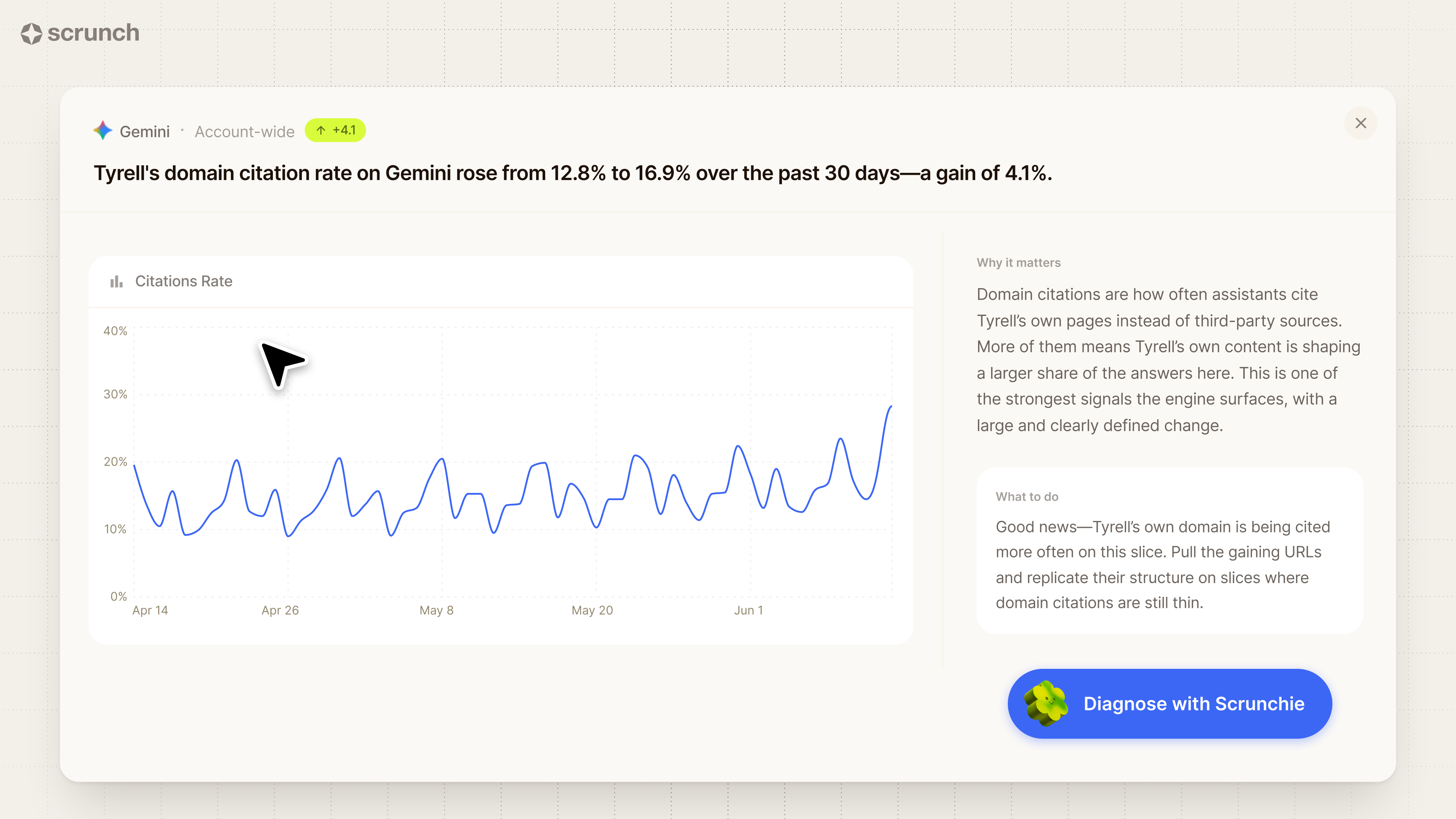
Every signal contains three things:
1. What happened: Factual, specific information about what occurred
Example: “Competitor A saw their mention rate for the ‘enterprise CRM’ topic rise from 40.3% to 49.8% over the past 30 days, a gain of 9.5 percentage points (pp).”
2. Why it matters: Contextual framing that draws from surrounding data
Example: "When Competitor A is mentioned more often, those answers have less room for you. Over the same window, your mention rate declined 2.8pp, leaving a 7.1 pp gap.”
3. What to do: Actionable suggestions for how to proceed
Example: “Treat this as a competitive-intelligence signal. Pull the cited pages on this competitor's domain and benchmark them against your brand's equivalents.”
And every signal gives you the option to immediately understand the “why” behind the “what” using our AI assistant, Scrunchie.
Click the “Diagnose with Scrunchie” button and it’ll dive deep into your data to identify the cause of the change and spotlight opportunities, complete with a short summary, supporting details, and a dashboard that explains the signal so you can review it in depth.
Every alert can be found in the Signals tab in Scrunch. Simply open it up in Explorer and drill down further.
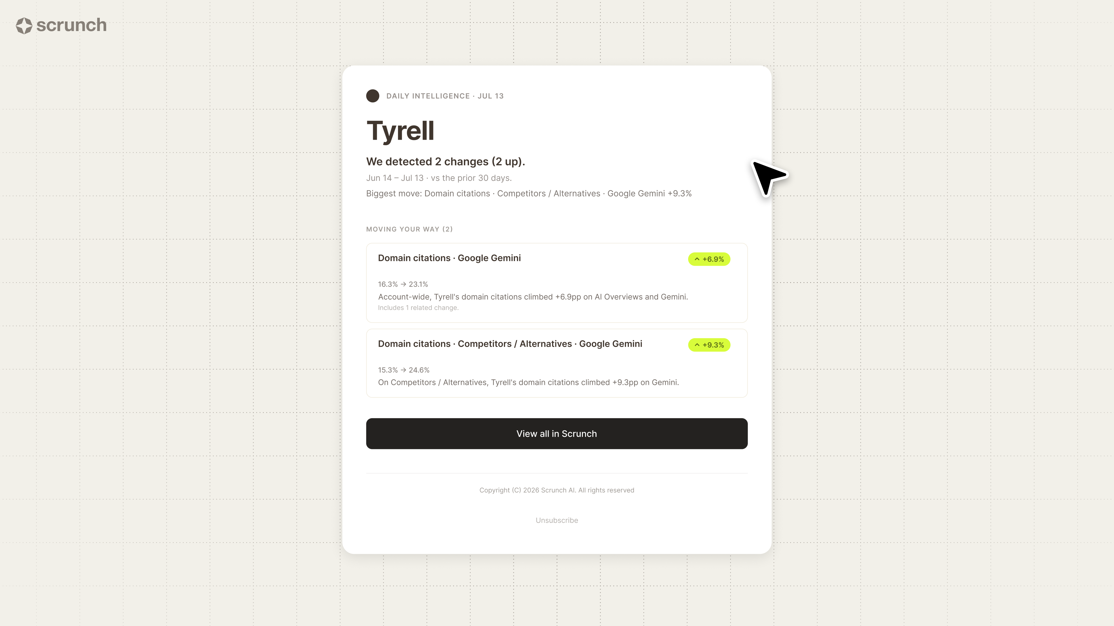
Signals can also be delivered to you and your team outside of our platform. Just configure how often you want to be notified (real-time, daily, weekly) and Scrunch will send you an email digest.
Explorer: Data questions, answered with a click (or conversation)
Signals is what Scrunch surfaces for you. Now let’s talk about what Scrunch lets you do.
Every prebuilt analytics dashboard is essentially a guess about which questions you want answered.
With Explorer, Scrunch is 100% customizable. You measure what matters to your business—not just the metrics we think you should care about.
When you’re ready to explore your data, click through from Signals or simply navigate to the Explorer tab in Scrunch.
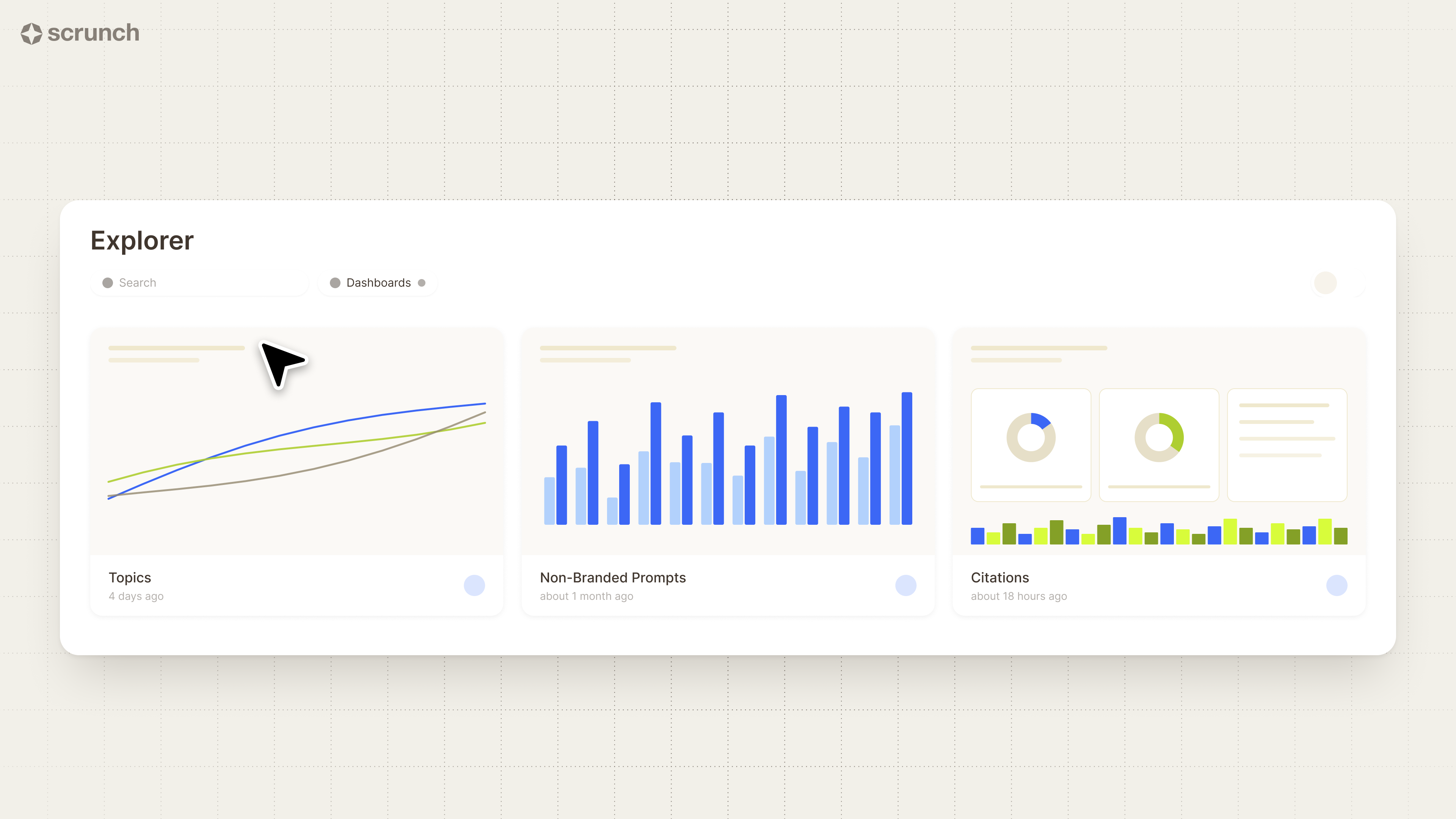
We start you off with a selection of dashboards based on our customers’ most common questions related to topics, non-branded prompts, and citations.
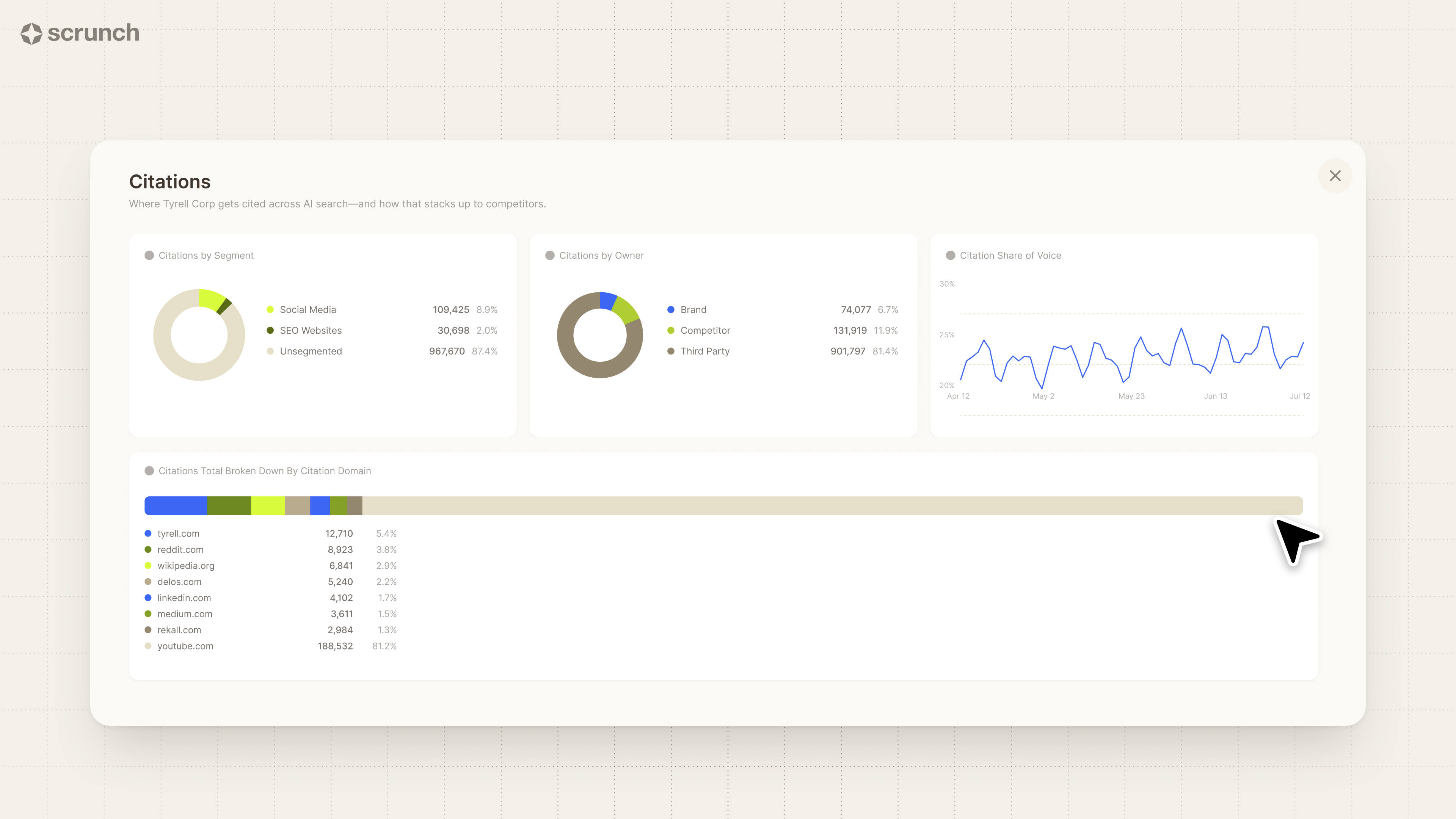
Just click “Open in Explorer” on any tile to enter your own personal data laboratory.
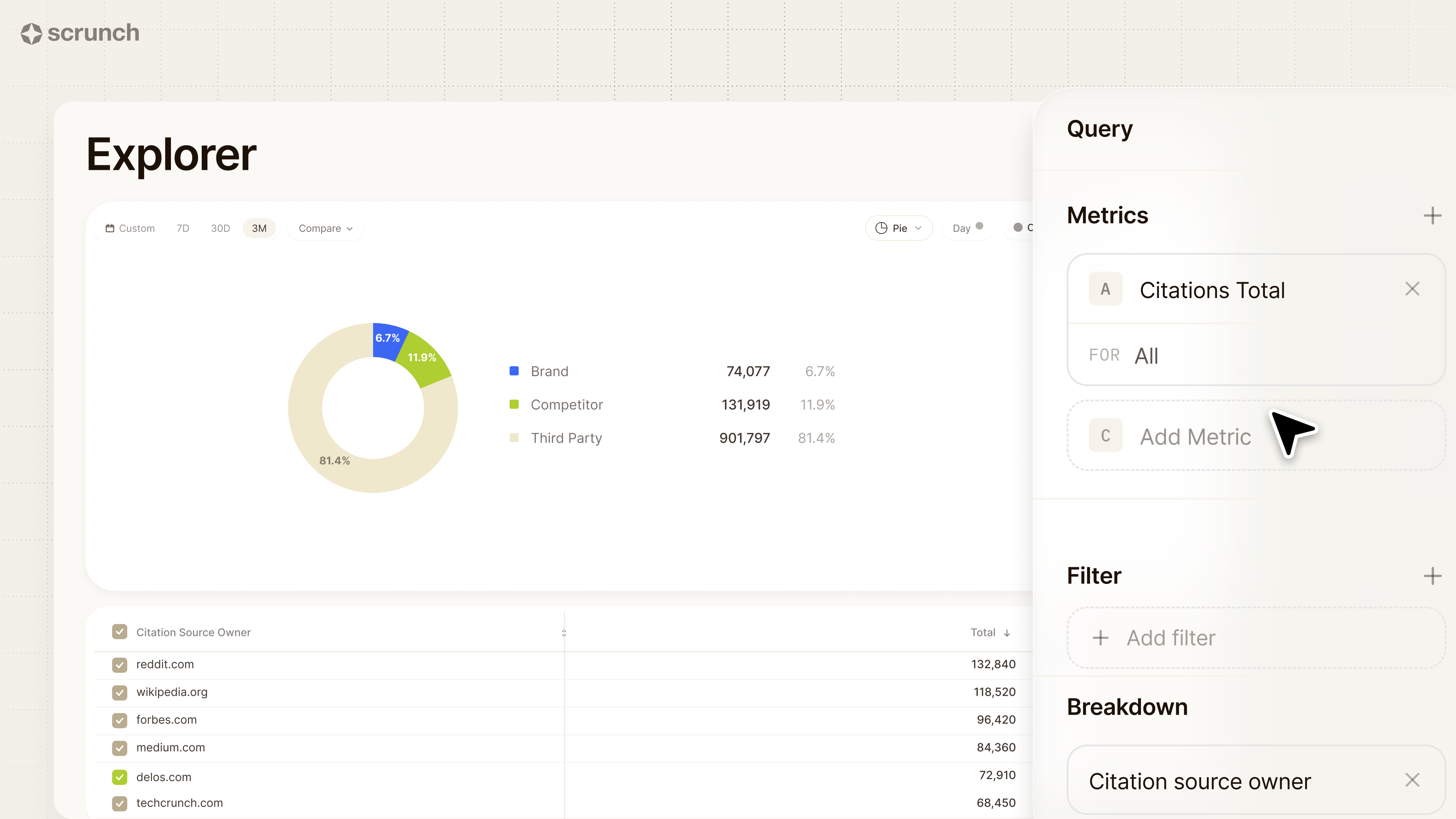
The query panel lets you build the exact view your question calls for:
- Metrics: Choose what to measure, from mentions and citations to answer position and share of voice and all points in between. Then set the scope: your brand, a sub-brand, or a competitor brand.
- Filter: Narrow down the data to the slice you care about, by platform, funnel stage, persona, topic, country, custom tag, and more.
- Breakdown: Split your results across the dimensions that fit your question with options that run the gamut from buyer-journey stage to citation URL.
At the top of the page is a toolbar that allows you to reshape your data further:
- Date selector: Select a custom date range or choose from prepopulated options.
- Compare: Compare current performance to past performance, from day over day to year over year.
- Timeline granularity: Break down performance by day, week, month, or quarter.
- Chart type: Pick whichever chart type you want (including stacked variants) to visualize your data—line, column, bar, pie, table, pivot table, or metric.
Want to spin up a dashboard for a single persona and see what actually drives your mention rate with them and which pages get you cited in the answers they're looking for? No problem.
Want to filter by funnel stage to see where you show up most across the buyer journey in ChatGPT versus Gemini? You got it.
Want to build a leaderboard that shows how your answer position compares to top competitors for specific topics? Piece of cake.
Plus, every metric we track for your brand, we also track for your sub-brands, your competitors, and your competitors’ sub-brands. In effect, you can build any brand’s view in Scrunch for the exact metrics you care about.
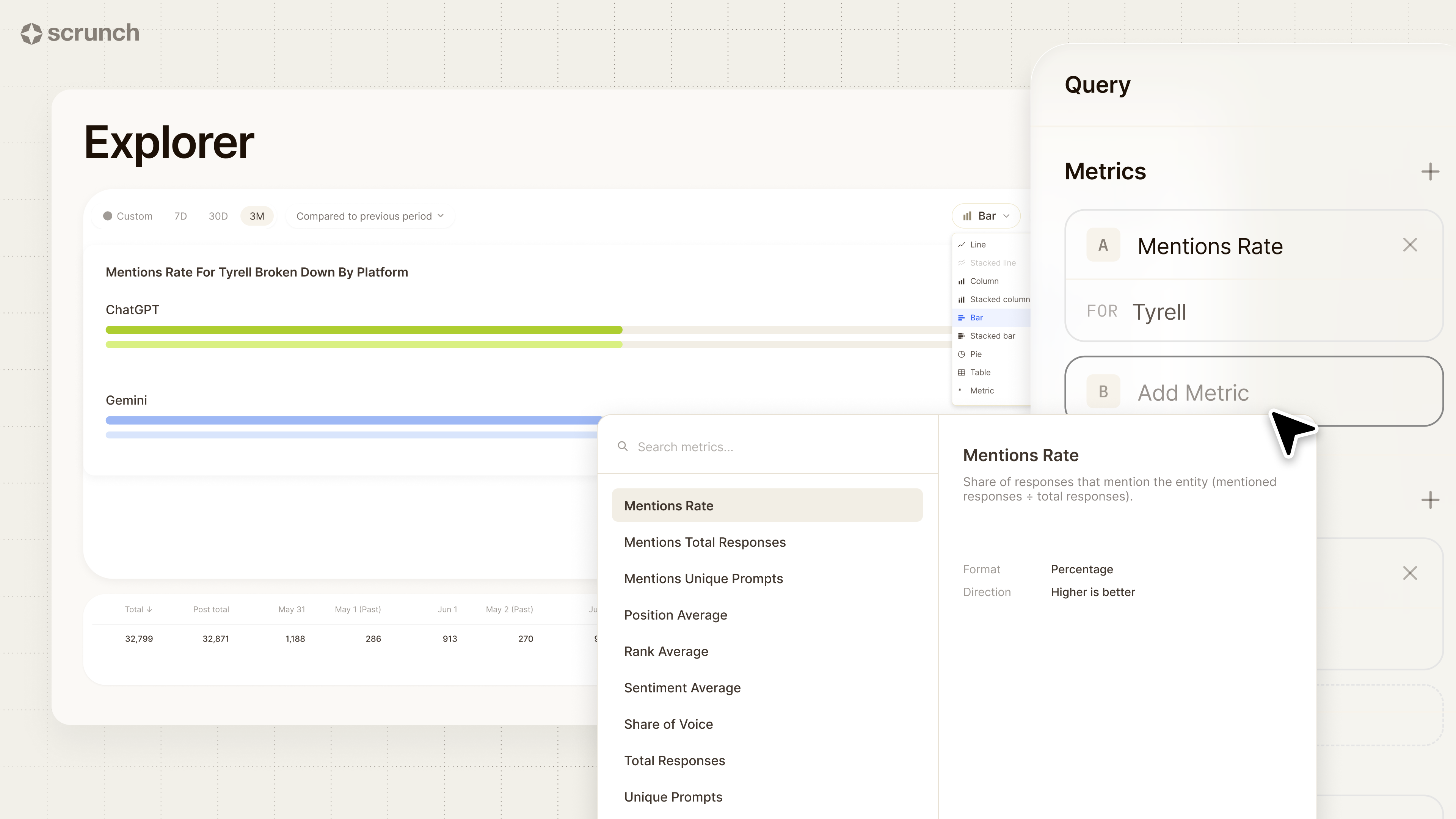
Any changes you make in the query panel or toolbar are reflected in Explorer's chart and data table in seconds.
Your chart is the answer to your question. Your data table is how you control exactly what’s displayed in the chart.
And every view you create in Explorer is a link. You can build it once and share it forever by simply copying and pasting the URL.
Save your data masterpiece in Scrunch and drop the link wherever your team works: Slack, email, Notion, a Google doc, your QBR deck.
There’s no need for screenshots or data exports. Just build a dashboard once and share the URL.
Anyone on your team can pick up where you left off. Open the link, hit Open in Explorer, and keep drilling. Your work becomes the starting point for theirs.
Explorer makes it easy to analyze your data exactly how you want. That includes a few new capabilities we think are worth calling out:
Conversational analysis
Scrunchie allows you to build data visualizations in Scrunch by just talking to your data. You can create any data visualization or answer any question with just a prompt.
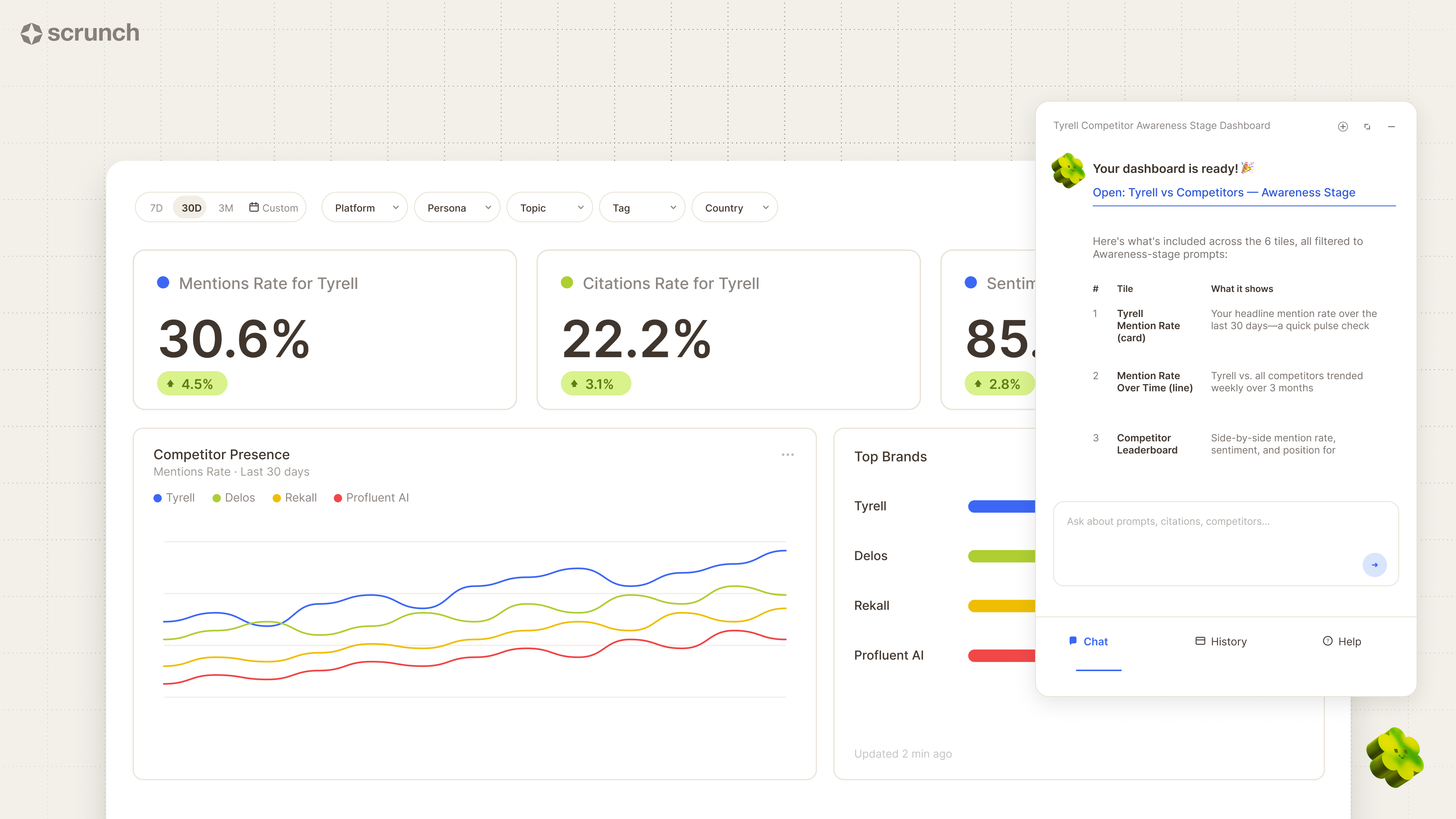
Simply describe what you’re looking for and let Scrunchie take the wheel in Explorer.
Compare mode
Compare mode gives you a quick way to track your performance over time in comparison to a previous period. In other words: It’s much easier to spot both growth and slippage.
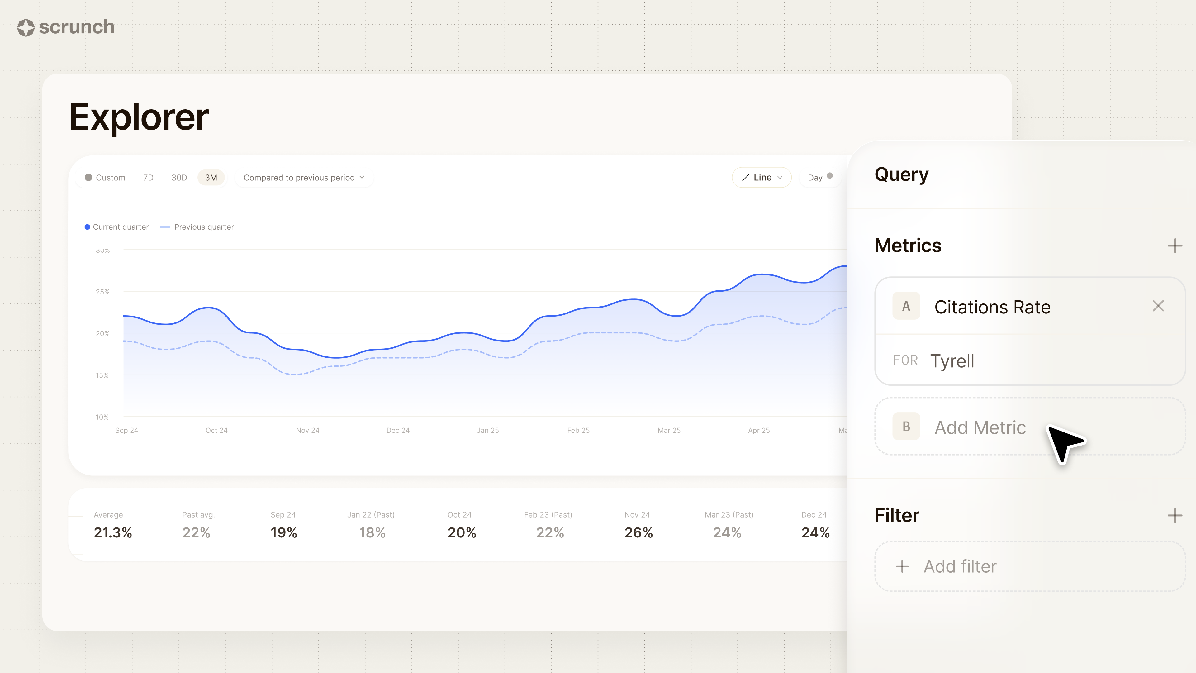
Consider it your QBR go-to: "Three months ago our citation rate in AI answers was X%. Today it’s Y%. Here's the line chart with both periods overlaid."
Multi-metric mode
Multi-metric mode makes it easy to analyze multiple KPIs on the same chart.
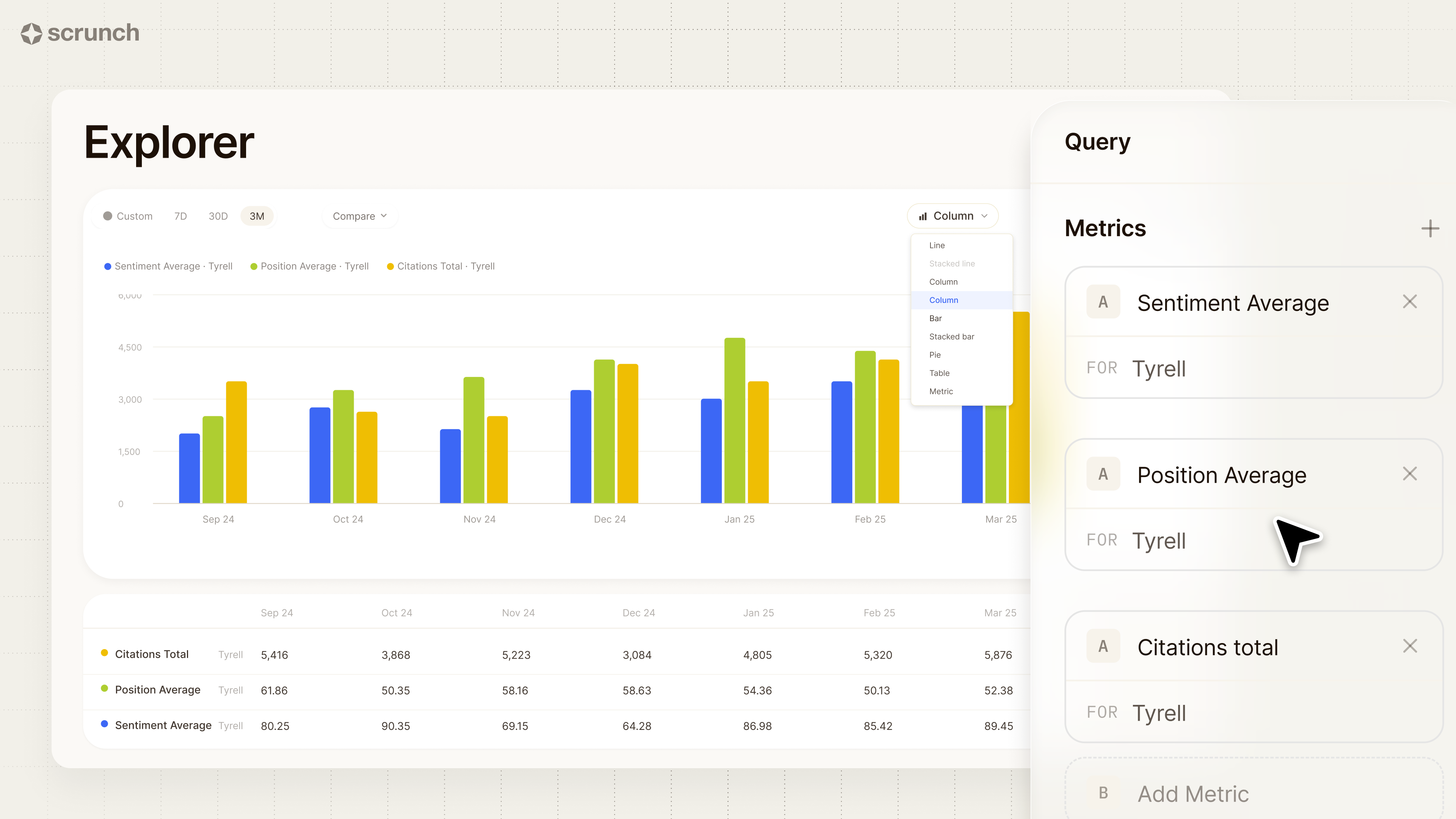
Maybe you want to compare sentiment and answer position alongside citation count. It’s doable in a few clicks.
Pivot tables
Pivot tables allow you to create multi-metric leaderboards, complete with period-over-period deltas and optional trend spark lines.
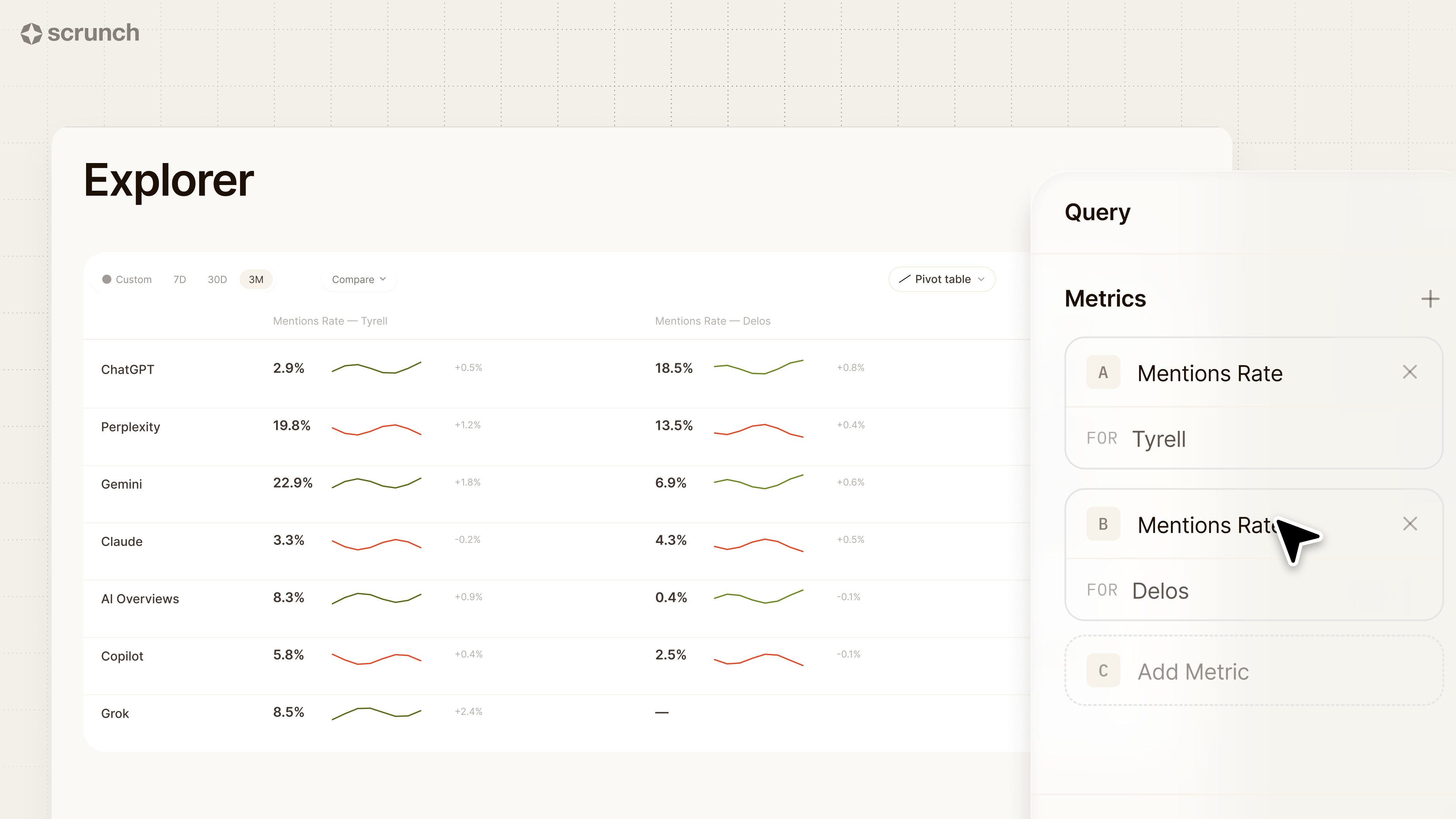
Want to compare your brand presence versus specific competitors over the last 30 days? Build your view (or let Scrunchie build it for you).
We surface what matters, you explore what’s next
You’ve got the data.
What you need is the “so what” behind it—and the ability to tailor it to your business and strategy.
Not a raw data dump, but guidance on what matters and what to do next. Not a static dashboard, but specific answers to your specific questions.
Signals and Explorer are what that looks like in practice.
Every change that matters, surfaced and explained. And the answer to every question, visualized in seconds and shareable as a link.
These features are the foundations for a more agentic Scrunch.
Our AI assistant can already diagnose a signal for you and create a custom dashboard. But that's only the starting point.
As these foundations mature, Scrunchie will unlock more and more of what you can do in our platform—so more of the work happens just by asking.
Signals and Explorer are now generally available for all Scrunch customers on all plan levels.
It's your data. We just make sure you never miss what's moving, and never hit a wall when you want to go deeper.
Turn dashboards into decisions with Scrunch
Trade static screens for answers you can act on. Start a 7-day free trial or get in touch to see how Scrunch can help you spot what matters in your AI search data and take action.


